Want to uncover more sales and grow faster?
Our A.I.-driven email marketing automation personalizes your messages for every stage of your customer’s lifecycle – eliminate the guesswork, save time, and boost the sales and retention power of your email marketing.
Grow your online sales and scale quickly.
Retention Science’s predictive ecommerce automation has helped clients increase their email engagement rates by 60 percent and their purchase rates by 45 percent. We can do the same for you. Simply provide the content and Retention Science will learn, test, and optimize your emails for each customer.
Sell More
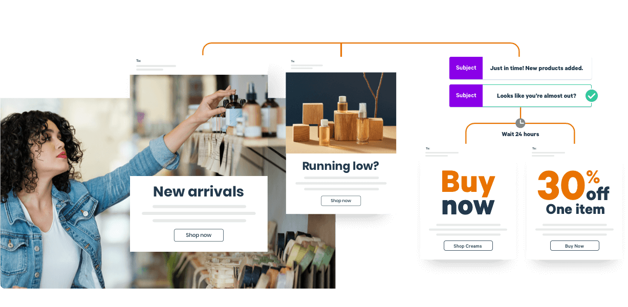
Intelligent lifecycle automation means no more missed conversion opportunities.
Save time.
A.I. optimizes individual emails on your behalf, significantly reducing manual work.
Boost engagement.
Retention Science organizes your data across all channels to segment and target your marketing.
A.I. for ecommerce.

“This is the only marketing platform that has consistently delivered ROI from day one, and a steadily increasing ROI the longer we use it. We just had another $30K email last week. That wouldn't be possible without these tools.”
BREE MCKEEN,
FOUNDER OF EVELYN & BOBBIE
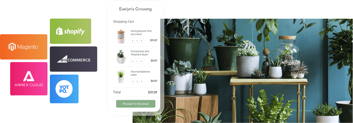
CUSTOMER DATA PLATFORM
Get all of your data in one place, enhanced by A.I. for smarter segmentation.

“The automation is beginning to run itself and is doing the thinking for us. This will give us more time to strategize and explore other features and options while maximizing our email efforts. This is allowing us to do more without hiring an additional member of our marketing team.”
NICOLE BRUDERER,
FOUNDER OF LIME RICKI
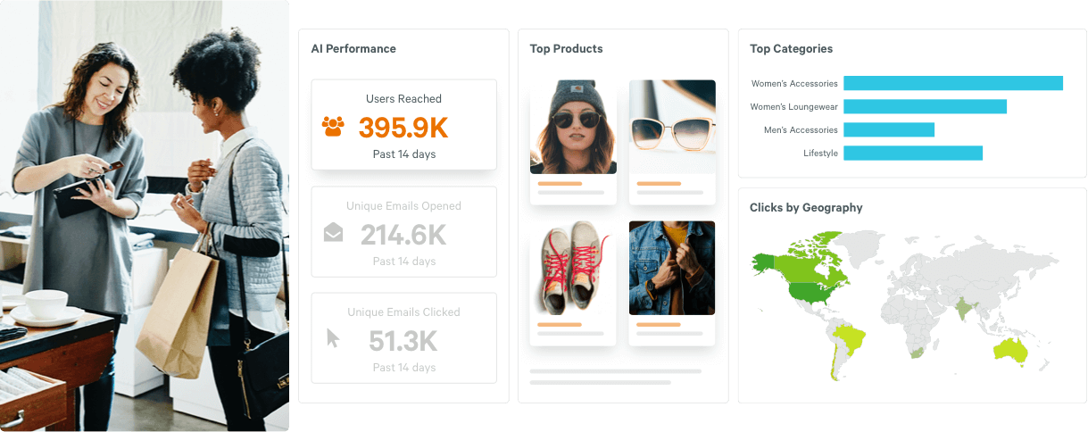
RICH DATA REPORTING
See what’s working with rich data reporting.
Hundreds of brands partner with us to reach more than 350 million customers each day.
